 To be considered mobile friendly your site should meet these three qualifications.
- All the text should be large enough to read easily.
- All the links should be large and easy to tap.
- None of the text or images should run off the page.
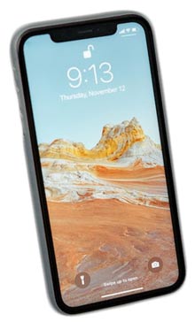
There are several easy ways to tell if your website is mobile friendly. The easiest of course is to view your site on your mobile device. Simply copy the web address of your site and email it to yourself. Then open the email on your mobile device and tap the Url in the email. Your site will open in your mobile browser.
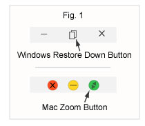
You can also simulate the mobile view on your desktop computer by opening your site in your browser and then dragging the edge of the window to narrow the screen. You need to float the window in the view to be able to grab the edge of the window. To do this click the Windows Restore Down in the upper right hand corner of your screen or the Mac Zoom button in the upper left hand corner of your screen. Then place your cursor on the edge of the screen and it will change to a double arrow. Click and hold your mouse key down and drag the edge of the window to make your screen as narrow as it will go. This will approximate how your site will look on a mobile device.
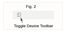
Finally, you can check your site the way developers do. This most closely emulates the actual behavior of your site on a mobile device. From within your browser press the F12 key which will open the developers window. In either the upper right hand or left hand corner of your browser window (the position of the button depends on which browser you are using) click on the icon shown in figure 3. This will show your site in the browser emulator which will give you a good indication of how it will actually appear on various mobile devices.